… paint a wall in an out-of-character bold colour, like orange?
#2
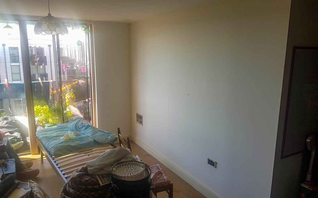
Before
I am, apparently, an autumn-colours person, a warm yellow-based palette with a degree of black and including orange. Surely, on that basis alone, orange paint is the way forward.
One side of our living room is a bright, distinctive green, the rest of the walls and ceilings are white with brown splodges. The splodges are from an invasion of small flying insects that gained entry via a pot plant. It does not strike me as necessary to feel sympathy for the fly graveyard on our wall as there were hundreds of them at the peak of the invasion and they made our life fraught with unexpected injuries, mainly swatting-induced. But I digress.
The whiteness (and splodges) have bothered me for a very long time, years. I have contemplated thick black lines with blocks of colour, a very light green with orange marigolds stencilled and painted on the wall and, now, realising the incompatibility of the current green wall and the green I had in mind for my Indian-themed marigold wall, why not go full marigold-orange instead?
I have a lovely book, The Little Book of Colour, by Karen Haller, in which there is a quiz to match your personality with colour. I’m a sucker for a quiz, especially when it tells me something I want to hear, eg that I am not a pastel person; I am autumn. It turns out my colour-blind partner is also an autumn personality (though he poo-poos anything so trivial as an anecdotal kind of quiz), on which basis I have justified an orange wall. And a, smaller, yellow wall.
Orange, according to Karen Haller, can be:
“… playful and over-stimulating … too frivolous …
[but also]
… encourages socialising and stimulates appetite”
Karen Haller, The Little Book of Colour
An orange wall, apparently, also exudes fun, playfulness, comfort, security, warmth, sensuality and passion.
However, I have a slight fear of orange, the brightness and the fact a large portion of the living room will be inescapably orange. I hope it won’t stimulate my appetite though, I’m already struggling with an over-stimulated appetite.
I like to get chore-type things done quickly, ideally in a day. My plan is to paint the large wall orange with a yellow frame, though I know the yellow frame will not be possible on the same day due to the unhappy combination of not-yet-dry paint and masking tape. The small-wall-area of the balcony door wall between the orange and green walls will be yellow, a strong yellow.
I suspect my memory has dulled the awfulness of painting in the three or four years since I last painted a wall, but I know that it hurts my hands (I’m a firm believer in painting rather than rollering) and the novelty wears off very quickly. Actually, I also recall the masking tape wall-protection being something I particularly disliked. And cleaning brushes.
I ordered the paint from Designer Paint and received my two paint pots nine days later (which, in view of Covid-19-related issues, is better than I expected). I have masking tape, paintbrushes and dust/paint sheets, the finding of which was not without rediscovering why our cupboard of dread (CoD) is so-named or without getting the CoD’s door handle lodged from the inside thus rendering the door unopenable from outside – I say that casually but there was nothing remotely casual about that 15-minute incident) but I’m ready to start now.
Just before I do, to reconfirm orange is the way forward, I am thinking word-association with orange:
fire (useful but can be dangerous and scary);
citrus fruit (tasty and cheery-looking);
marigolds (India, cheerful);
Guantanamo Bay jumpsuits (eek);
Agent Orange (oh, really; bad trajectory);
Hermès (fancy, expensive, covetable);
EasyJet (budget, holiday);
“You’ve been Tango-ed” orange Tango (chemicals and colours and artificiality).
That may not have helped me overcome my orange worries. I’ll just go for it.
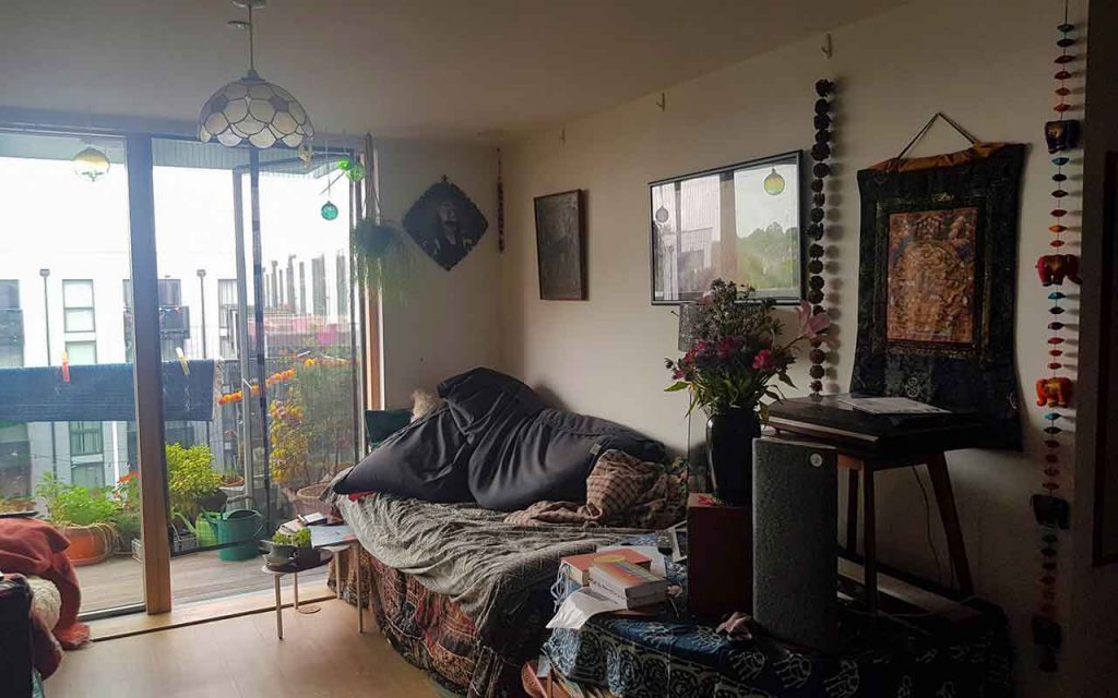
White walls 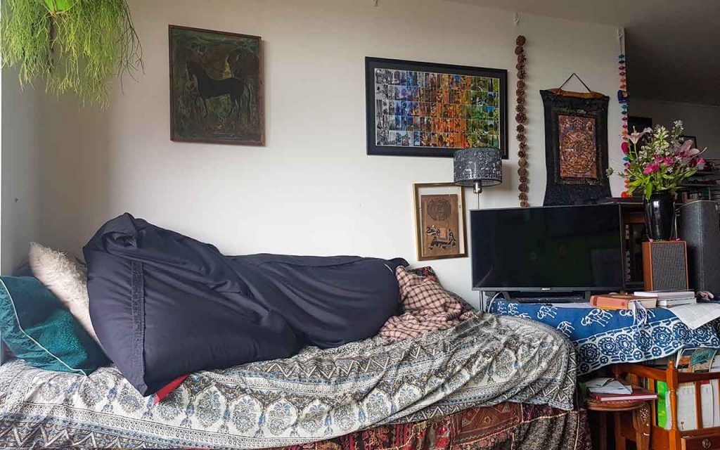
Messy day bed and TV area
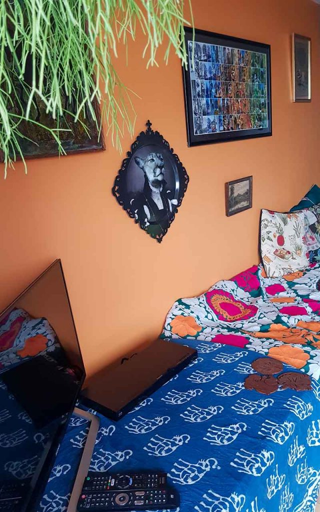
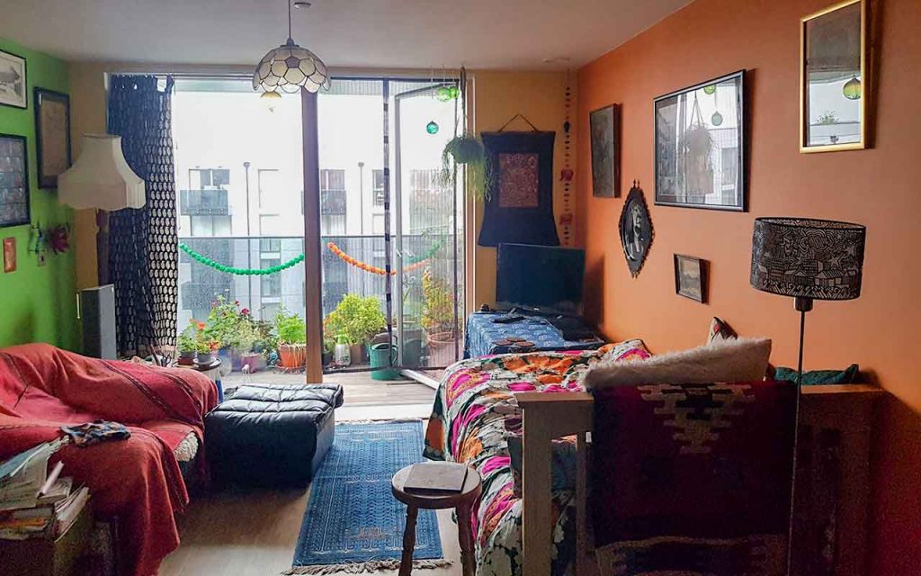
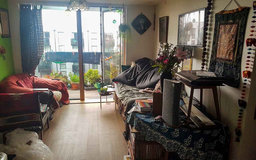
After
Orange is so the new white. I am a decorating genius. Ish.
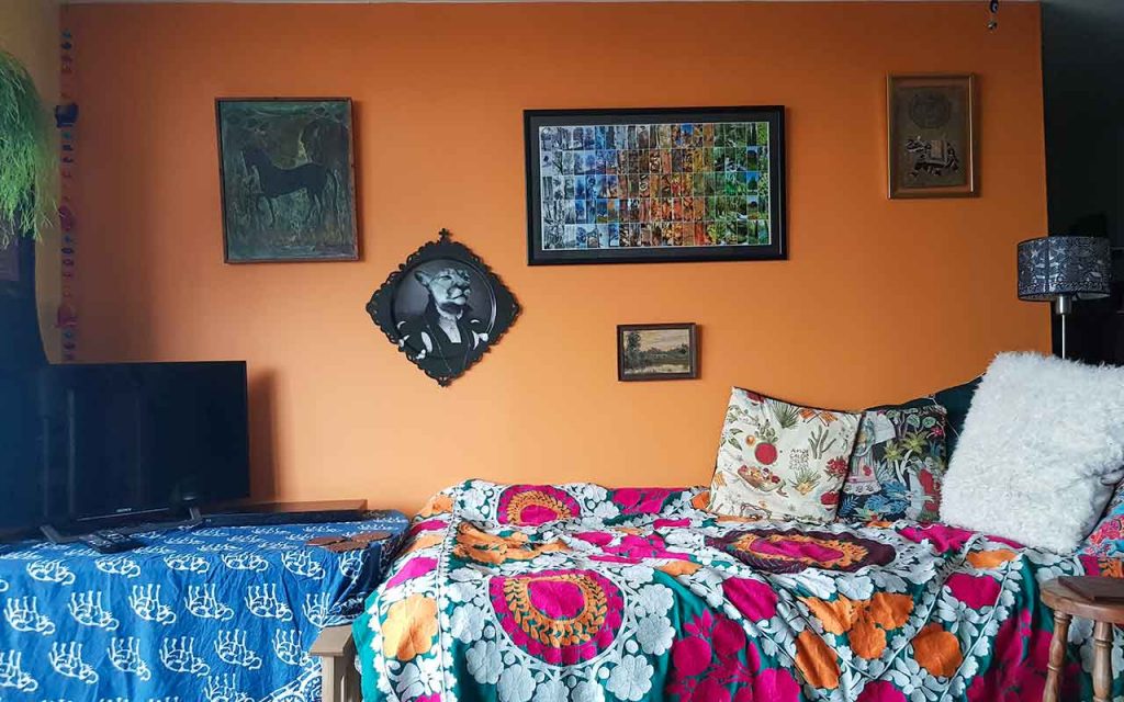
Admittedly, our living room now resembles a tube of fruit pastilles (a few of which, incidentally, I have just eaten) but what’s not to love about walls that remind you of fruit pastilles?! And better fruit pastilles than Guantanamo Bay prisoner jumpsuits.
As for the painting, the yellow frame to the orange wall fell at the first hurdle (the complication of marking it out) and there were more stages to dislike than I had remembered:
the removal of the masking tape wasn’t without issue (especially when I had to remove tape from the day-old-painted orange wall so I could paint the adjoining wall yellow);
the top parts of the wall needed to be painted from a chair with one hand clutching the tin of paint. This process was neither fun nor without issues (one brand of paint was quite runny and drips hardened and remain near the bottom of the wall and I didn’t think to protect the wooden chair from paint splatters);
paint brushes need a lot more rinsing and cleaning than expected, and I expected a lot of cleaning (fortunately, orange and yellow mix well and make a good adjoining wall blending feature);
the plastic sheets to cover the floor are useful, if not essential, but difficult to walk on … for the cat too (tense moment when the cat walked across the plastic and just skimmed over some fresh yellow drips, my feet got caught up in it while carrying a sloppy, full can of paint and my painting-Crocs managed to print a few patches of paint where it shouldn’t have been);
and all that waiting between coats and for one wall to dry fully before the second, adjoining wall can be painted (frustrating for someone who hoped to complete the task in one day and who kind of forgot how disruptive it would be with furniture all over the place and no TV for two nights).
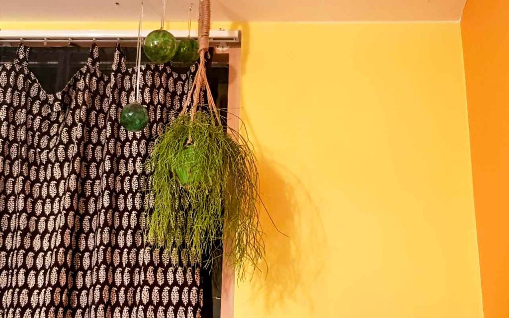
Yellow and orange 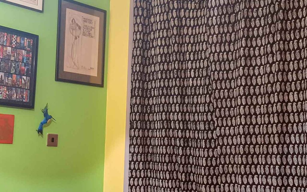
Yellow and green
As for the ugh-ness of painting, it was no better (or worse) than I had expected, though that moment after I’d smeared the first small section of the wall and realised how much more there was to go was a bit of a “why, oh why, did I decide to do this” reality check.
The ceiling, horrid, cheap, white new-build paint, is still white (with aforementioned dead fly splodges) but the orange reflects a bit onto it and makes it look less white. The light in the living room has changed a lot. When I go into the room in the mornings, it now looks like a light has been left on as there is a glow.
Was it worth the upheaval (I moved around a lot of furniture between two rooms), the chore of painting and a whole weekend devoted to decorating and moving furniture around? Most definitely, yes. How did you cope without a TV for two nights? Ha, ha, we watched paint dry! Do I like the new look? Yes, and in fact I like it more every day.
(Orange paint is Marigold by Little Greene, yellow is Lemon Sorbet by Albany, both ordered through Designer Paint. I ordered 2.5l of Marigold (1l would have been adequate) and 1l of Lemon Sorbet. Without doubt, the Albany paint was the easiest to use as it was very thick and didn’t drip, but it does start drying quicker than runnier paints so thick splodges need to be dealt with fairly swiftly)
